Create a chart
- Select the data for which you want to create a chart.
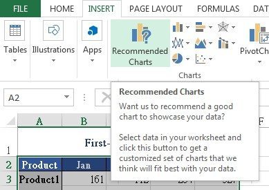
- Click Insert > Recommended Charts.
- On the Recommended Charts tab, scroll through the list of charts that Excel recommends for your data, and then click any charts to see how your data look like using this chart. If you do not see a chart you like, click All Charts to see all available chart types.
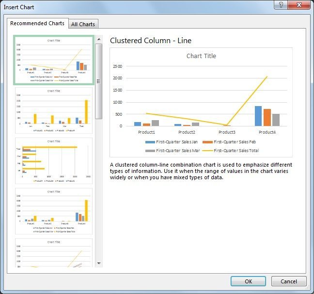
- After you find the chart you like, click it and then click OK.
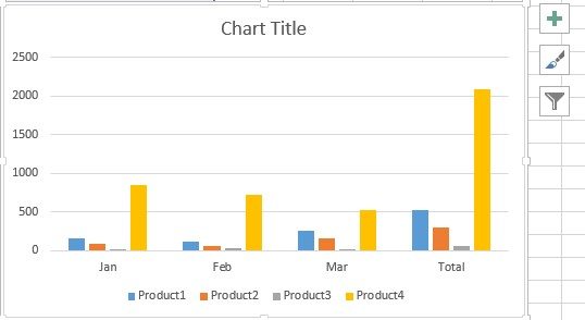
- Use the Chart Elements, Chart Styles, and Chart Filters buttons next to the upper-right corner of the chart to add chart elements like axis titles or data labels, customize the look of your chart, or change the data that’s shown in the chart.
- To add more additional design and formatting features, click anywhere in the chart to add the Chart Tools to the ribbon, and then click the options you want on the Design and Format tabs.