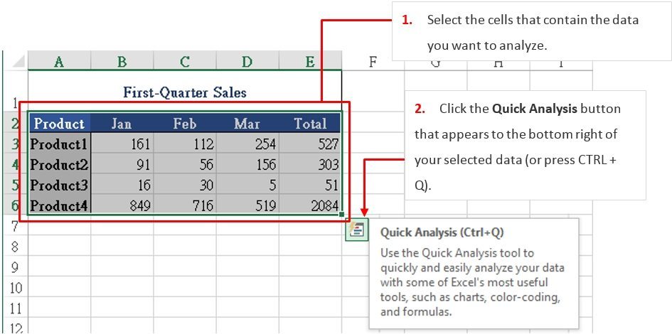
If you are not sure which analysis option to use, below is a quick overview.
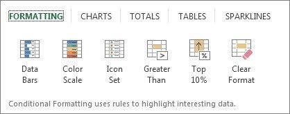
Formatting
This function lets you highlight parts of your data by adding data bars and colors. This lets you quickly see high and low values, or other things.
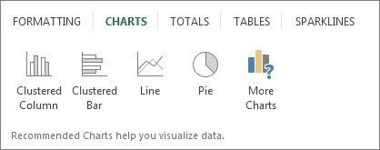
Charts
Excel will recommend different charts, it is based on the type of data you have selected. If you do not see the chart you want, click More Charts.
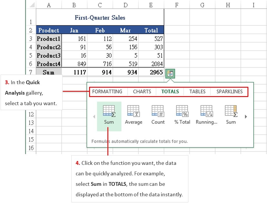
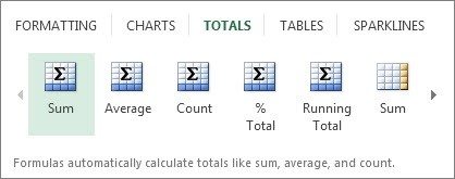
Totals
This function lets you calculate the numbers in columns and rows. For example, Sum inserts a total that grows as you add items to your data. Click the little black arrows on the right and left to see more additional options.
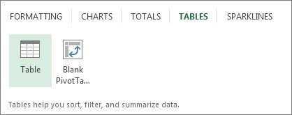
Tables
Tables can make earlier to filter, sort and summarize your data.
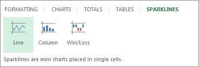
Sparklines
Sparklines provide a quick way to see the trends.